
Got gold?
Because if history repeats itself, this asset is the must have in your portfolio.

The conflict in the Middle East seems unwilling to end anytime soon. As a result, inflation is rising across the globe, and sharply so. Which is exactly why the same dangerous chart is popping everywhere, mostly designed to dominate headlines. But what interests me most is the opportunity this chart presents if history repeats itself.
Oil Crises
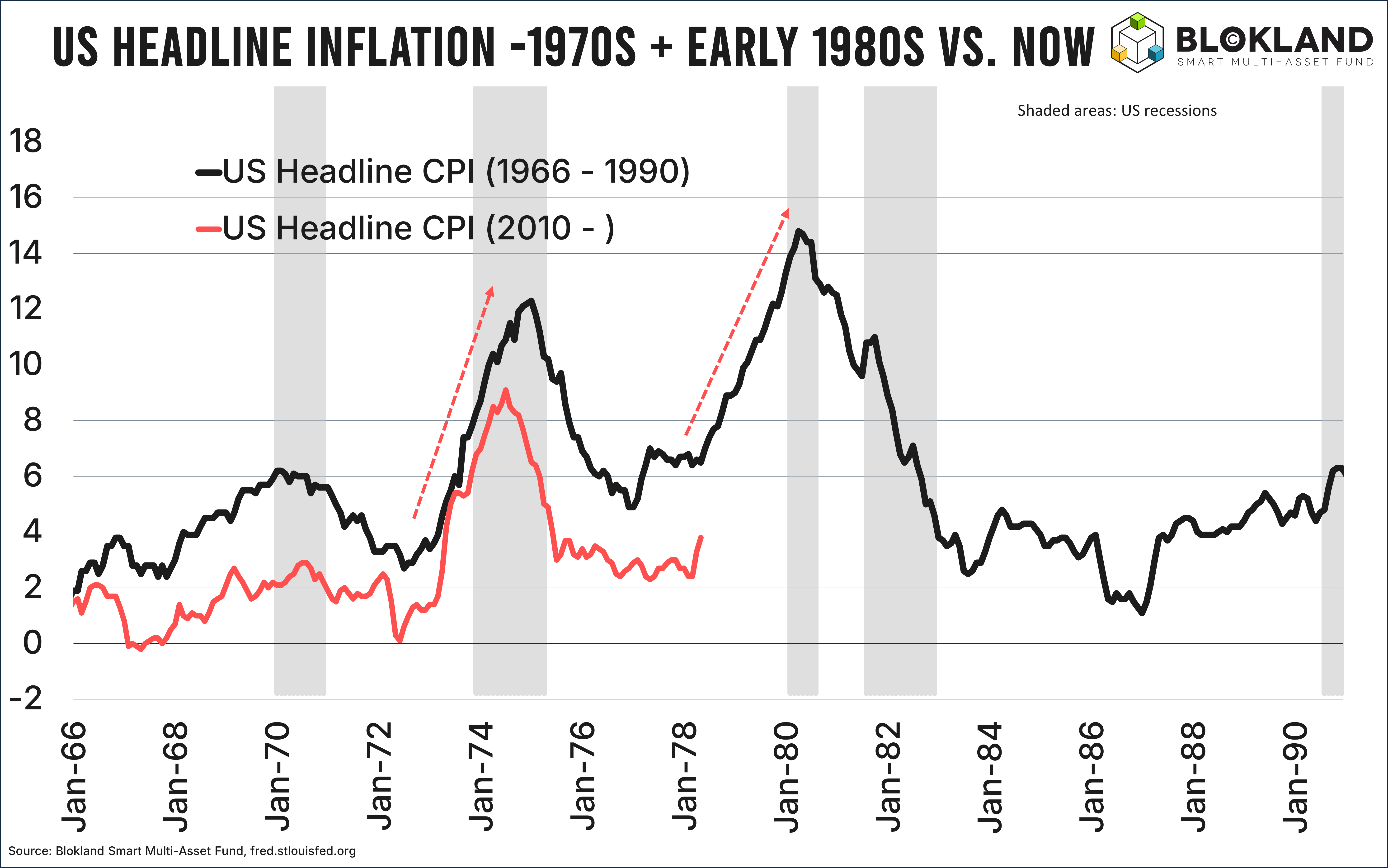
The chart I am referring to is shown below. It compares US inflation between 1966 and 1990 (black line) with inflation since 2010 (pink line).
The reason this comparison is resurfacing is simple: oil.
In 1973, OPEC boycotted oil exports from Arab oil-producing countries as a political weapon during the Yom Kippur War. In retaliation, the Arab members of OPEC stopped supplying oil to countries supporting Israel, including the United States and the Netherlands. As a result, oil prices quadrupled, and US inflation surged above 12%.

Before the world had even recovered from this first oil crisis, a second one followed in 1978. During the Iranian Revolution, a term that perhaps no longer fully captures what ultimately happened, Iranian oil workers went on strike, causing oil production to grind to almost a complete halt. To put this into perspective: Iran was the world’s fourth-largest oil producer at the time. During the panic that followed, oil prices nearly tripled. After this second oil crisis, US inflation accelerated even further and eventually peaked at a staggering 14.8%.

Déjà Vu
Israel, Iran, oil, it is difficult to deny that the current situation resembles what happened roughly fifty years ago. Or let me phrase it differently: largely the same players are involved in today’s energy price spike.
Which is exactly why the comparison between inflation then and now is not appearing out of nowhere. As you can see at the end of the pink line in the chart above, US inflation jumped sharply in April. Precisely at the same point in time when inflation started accelerating again in 1978, after the first oil crisis. So far, the two lines are moving in a remarkably similar fashion.
Crystal Ball
Obviously, it is nearly impossible to predict whether we are about to witness a repeat of what happened fifty years ago. If Trump announces a peace deal tomorrow and the Strait of Hormuz fully reopens, there is more than a good chance this inflation spike will ultimately prove manageable.
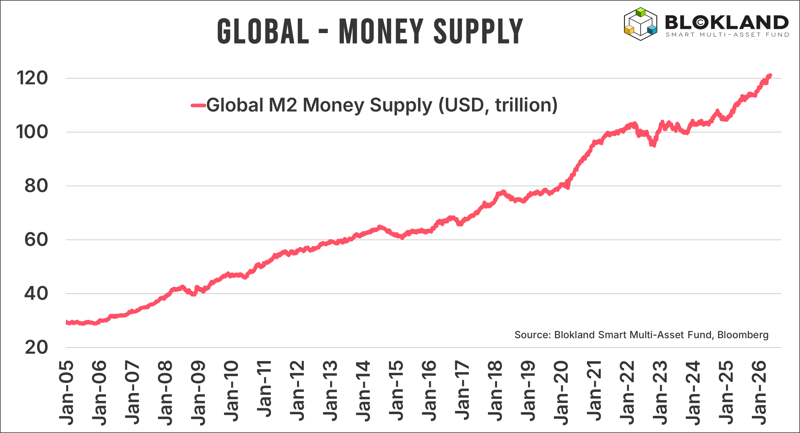
That said, even before the attacks on Iran began, there were signs that inflation could easily reaccelerate. Money supply growth was, and still is, growing at a stellar speed, especially considering there is currently no recession or financial crisis to speak of.
Inflation Risks Remain
Meanwhile, the budget outlook for many governments has become considerably more fragile. Interest rates in many countries are now near their highest levels in twenty years. The major difference compared to twenty years ago: debt.
Global debt levels have exploded, which means higher interest rates now have a much larger impact on total interest expenses. If nothing changes, those expenses could rise from only a few percent of GDP to five or even six percent of GDP. In Japan, interest expenses could rise to an astonishing 10% of GDP over the next decade, implying a huge spike in the Japanese budget deficit.

The prospect of rapidly rising interest expenses creates a crucial dilemma for central banks. Do they attempt to preserve what remains of their dented credibility by hiking interest rates if no quick solution emerges in the Middle East? Or do they quietly admit inflation has become secondary and keep all options open to push interest rates lower should the situation become too painful?
Either way, even if peace were signed tomorrow, inflation risks are unlikely to disappear overnight.
Will History Repeat Itself?
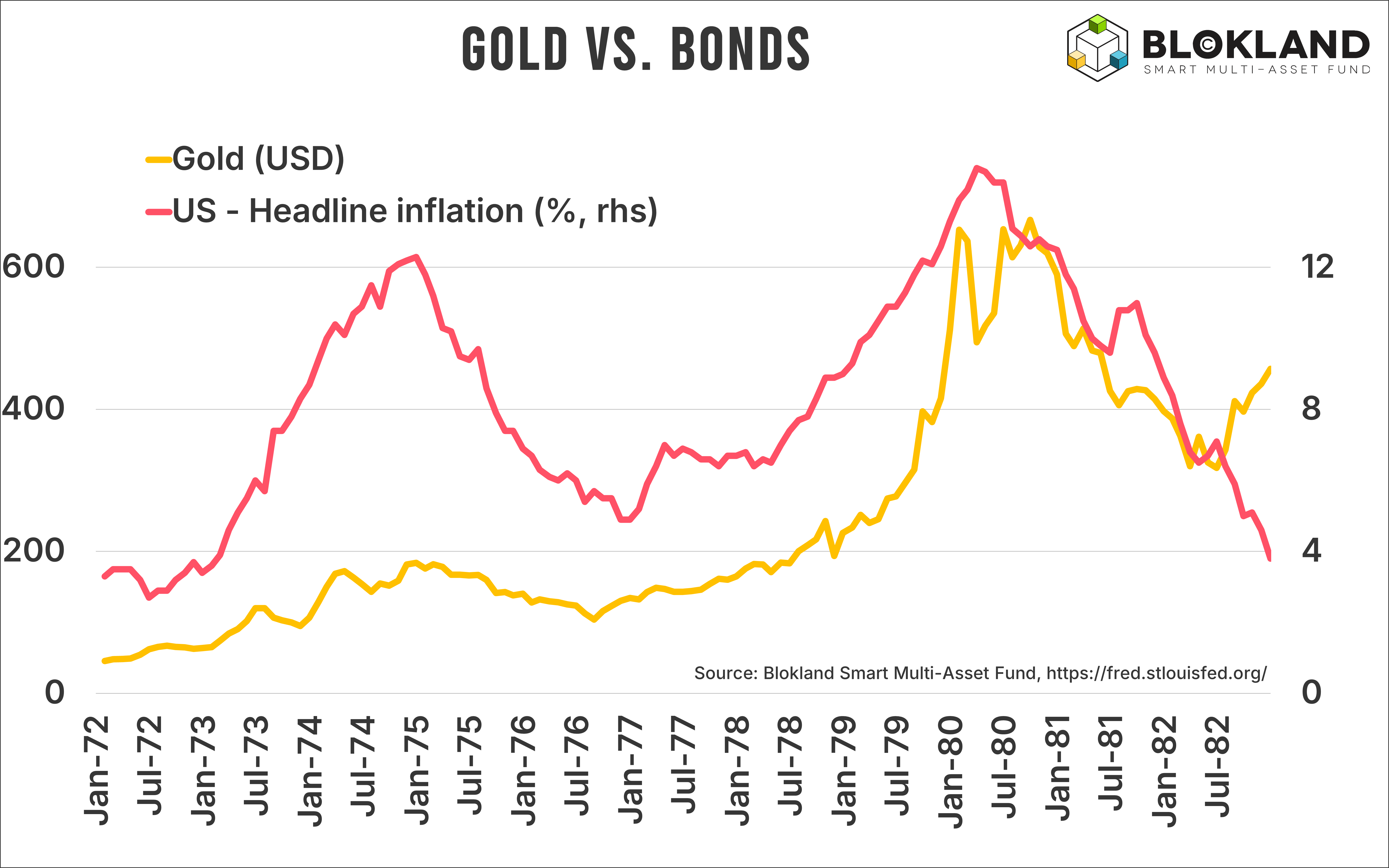
There is one area where the comparison with the 1970s breaks down entirely. Since the outbreak of the war, gold prices have fallen sharply. That was by no means part of the script fifty years ago.
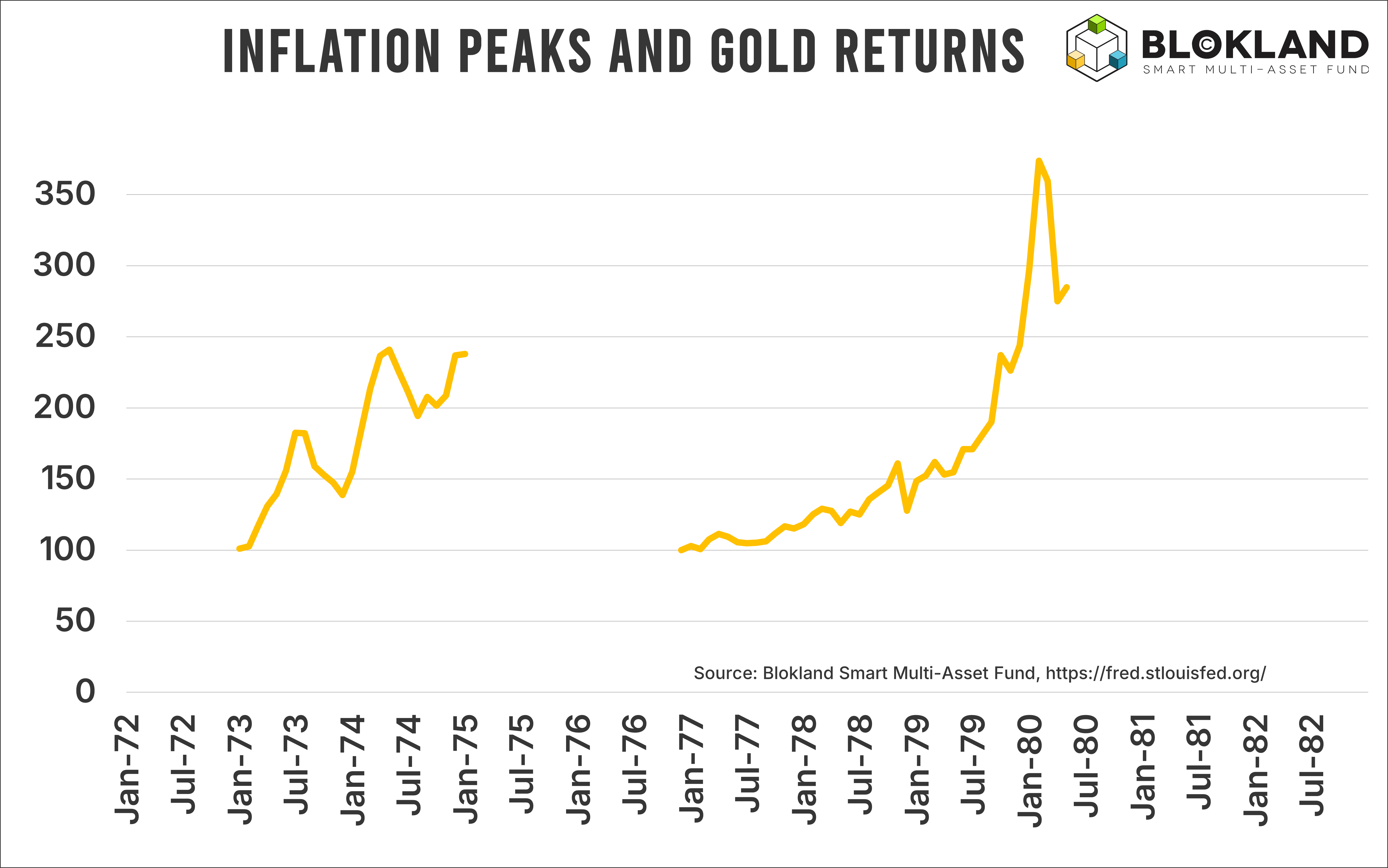
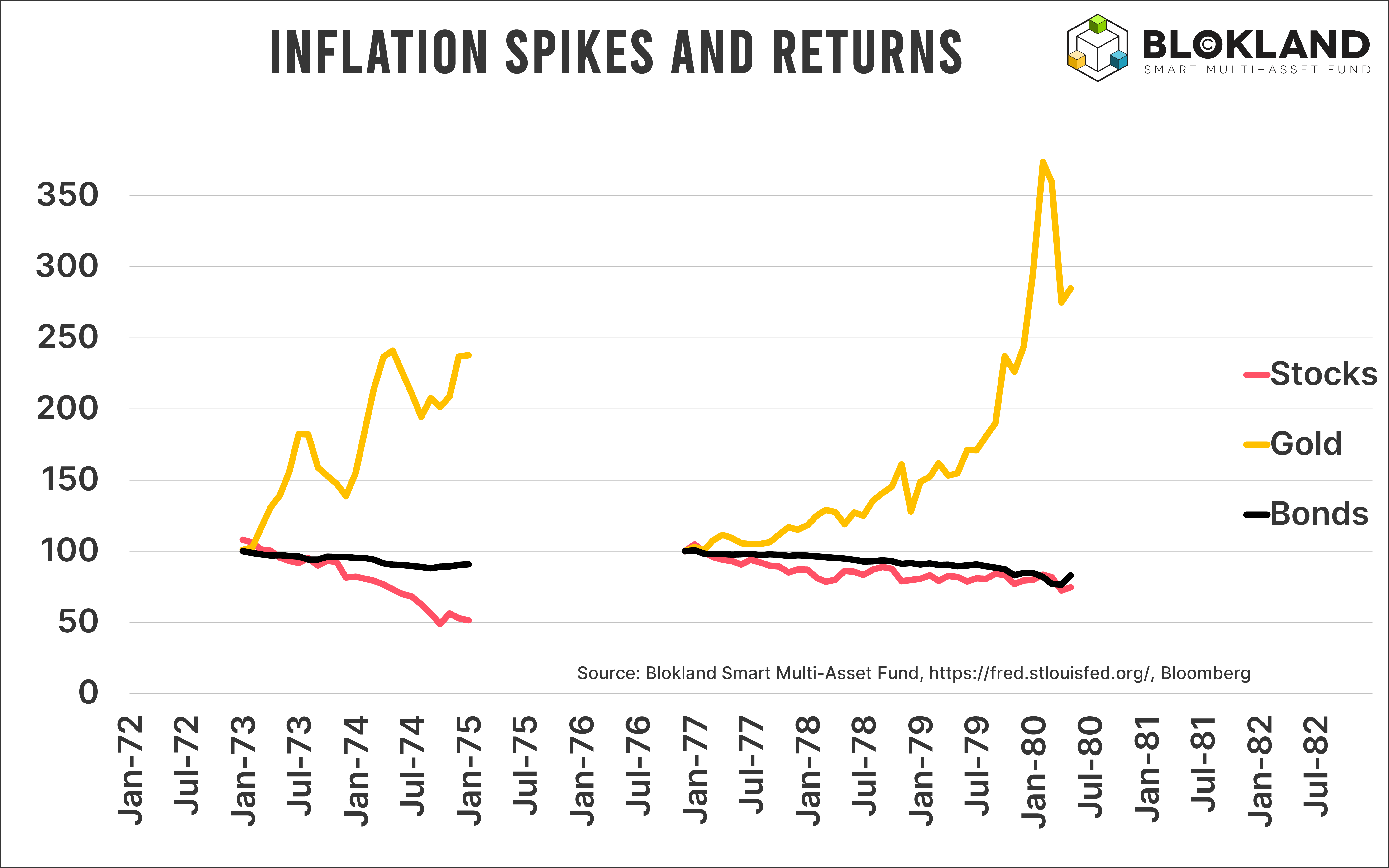
During the first oil crisis, the real price of gold, adjusted for inflation, rose a whopping 238% between the bottom and peak inflation levels. I deliberately use inflation-adjusted returns here, because inflation itself was so extreme. Nominal returns are rarely what matter most, but when inflation rises above 10%, real returns are the only returns that count. And between 1972 and the end of 1974, those real returns on gold were outright extraordinary.
But it gets even more extreme.
During the second oil crisis, gold prices skyrocketed another 285% in real terms. If such a move were to happen from current levels, you would be looking at a gold price comfortably above $10,000 per troy ounce.
Other Investments?
How did other asset classes perform during those oil crises?
Far less spectacularly, to put it mildly.
In real terms, again after inflation, stock prices were nearly cut in half. During just two years, equities lost 49% when corrected for general price increases. That is pretty remarkable. And painful. During the second oil crisis, the damage was less severe, but still highly significant at 25%.
And bonds?
After inflation, bonds lost 11% and 17% during the first and second oil crises, respectively. Not exactly impressive for an asset class many investors still casually describe as “safe.” But once inflation enters the picture, bonds tend to perform consistently poorly.
Based on the comparison between today and fifty years ago, there was only one asset class you would truly want in your portfolio.
But as of today, that asset class, gold, remains absent from the vast majority of investment portfolios.
This Time Is Different
Of course, there are important differences between then and now. The first oil crisis took place shortly after President Nixon abandoned the gold standard. Gold prices also corrected sharply between the two crises.
Today, the United States is far less dependent on Arab oil, which increasingly flows toward Asia instead. And there are countless additional differences people can point to as reasons things will unfold differently this time.
Still, even though I have learned to be somewhat cautious with forecasts such as $10,000 gold, the probability of another major breakout should not be underestimated.
Back in the 1970s, the world had just abandoned the gold standard. Now, we are moving toward a new, albeit implicit, monetary standard. Led by China and other emerging economies increasingly eager to reduce their dependence on the US dollar.
At the same time, inflation risks are likely to remain elevated even after this conflict eventually ends. The same applies to geopolitical tensions, explosive money supply growth, and the growing pressure on governments to keep interest rates artificially low.
I have always had an aversion toward the phrase This Time Is Different. Because more often than not, things end up looking remarkably similar to what we have already seen before.
Which is why my own addition to the spectacular inflation comparison between then and now is simple:
Got gold?
Blokland Smart Multi-Asset Fund
We expect inflation risks to remain structurally higher than most investors have grown accustomed to. High debt levels, extreme government and central bank policies, and rising geopolitical tensions form a dangerous mix for inflation.
That is exactly why the Blokland Smart Multi-Asset Fund allocates 25% of its assets to physical gold, safely stored in a vault in Switzerland.
Are you interested in the Blokland Smart Multi-Asset Fund or would you like to participate? Feel free to schedule a no-obligation call through this link or send me an email at jeroen@bloklandfund.com.
Kind regards,
Jeroen Blokland

The real return data from the two oil crises is the most useful historical anchor in this piece. Equities down 49% in real terms during the first crisis, bonds down 11%, gold up 238%. During the second, equities down 25%, bonds down 17%, gold up 285%.
The asset class hierarchy in a persistent energy-driven inflation regime is clear and consistent. From a SAA perspective, Alpha Research Capital Market Assumptions, updated April 1, 2026, price Gold at 4.45% annualised, identical to US TIPS and above Global Government Bonds at 4.04%. That pricing implies the market treats gold as an inflation hedge rather than a structural real return asset.
The 1970s data suggests the two are not the same thing: in a persistent inflation regime, gold did not hedge inflation, it dramatically outperformed it. The assumption that most challenges this scenario is the one the author correctly identifies: US energy independence. The 1973 and 1978 crises created direct consumer price shocks at the pump in a way that is structurally different today. That difference could compress the real return differential significantly even if the directional call is correct.
Federated Hermes notes that gold "remains a core diversifier in multi-asset portfolios during periods of stagflationary pressure," Federated Hermes, Asset Allocation Award winner 2026.
The question is whether the current episode is persistent enough to trigger the second leg.
Great as always. Thanks for your content.
There is an error though in the legend of the last graph. I guess the yellow line is gold.